Welcome to my portfolio samples. Having worked in the multimedia field for quite some time, I have amassed a portfolio that includes a variety of client types. I decided to put together a small sampling that shows diversity in style and approach to give and idea of my capabilities in various mediums and situations. Please take a minute of two to look through my samples.
Select a tab below to view portfolio samples with a project and client summary.
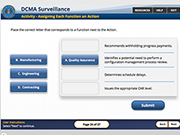
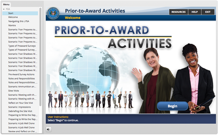
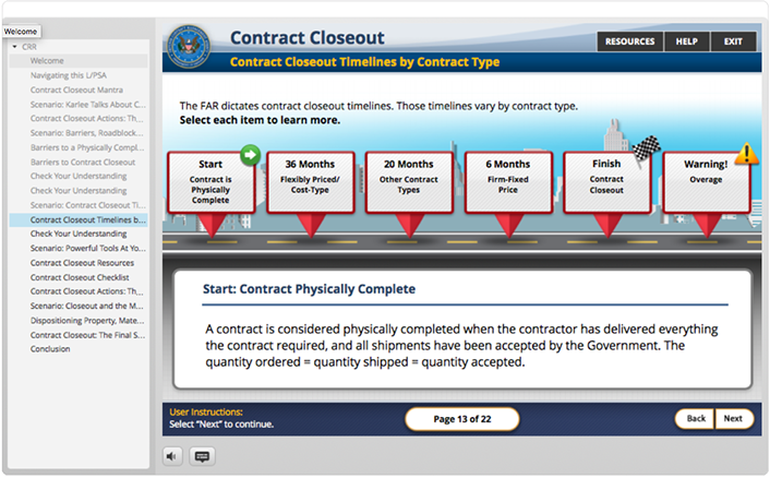
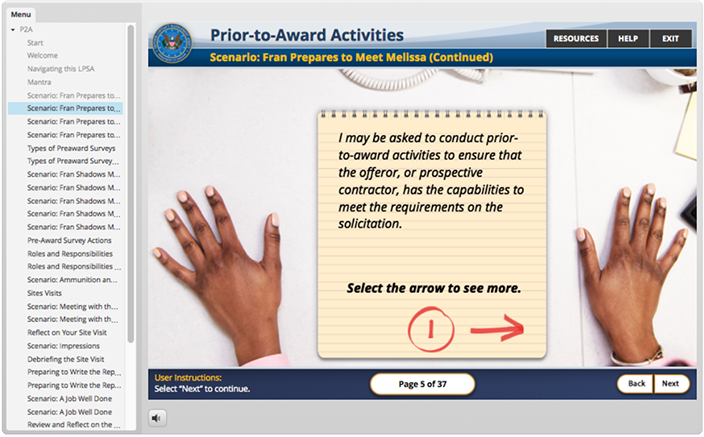
U.S. DEFENSE CONTRACT MANAGEMENT AGENCY: DCMA Multifunctional Orientation
DAU: : DCMA Multifunctional Orientation
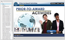
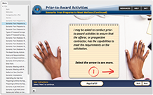
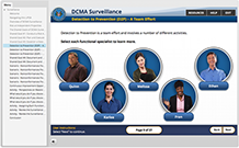
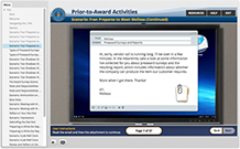
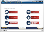
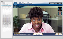
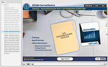
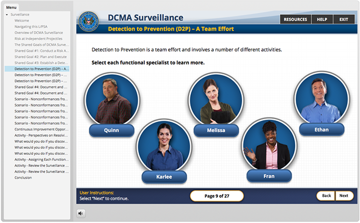
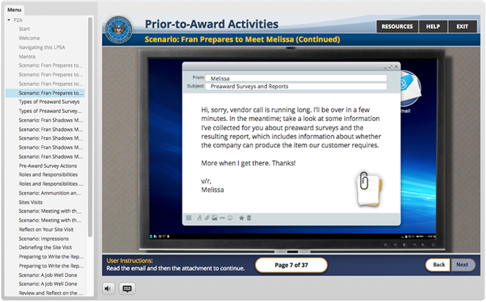
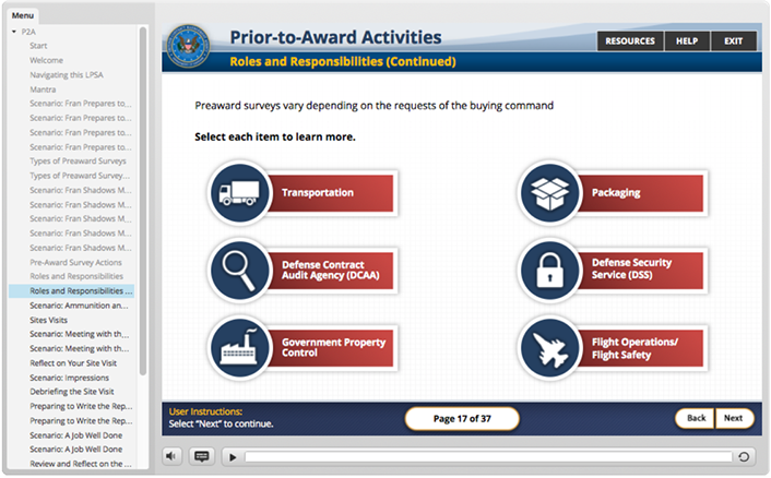
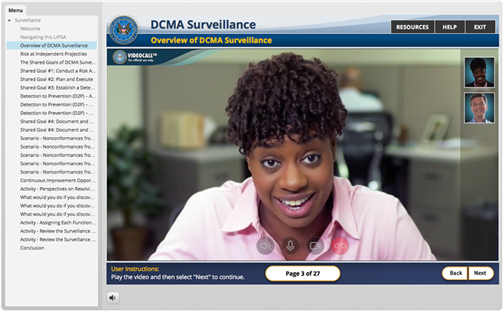
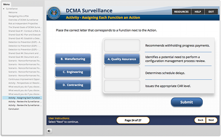
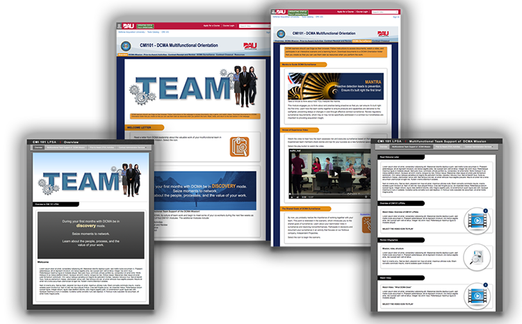
An on-line tool to be utilized by new DCMA employees to get a better understanding of what DCMA, as an angency. is all about. This project encompassed a lot of different development technologies. The final product was a website hosted inside a SharePoint platform. The course utilized HTML5/CSS/JS, live video, Adobe After Effects based animations and four interactive Articulate 3 modules.
My responsibilities included the look and feel and cohesiveness for both the website and the integration of the interactive modules. I created the HTML5 wire-frame for the website as a proof of concept, oversaw implementation of the client color schemes with junior staff for the the final website design. I was also responsible for creating all the graphics in the interactive modules, programming the modules, and some of the Adobe After Effects animations used in the live video. There was also a large game in one of the modules. I have given the game it's own tab below due it's scale.
The whole website can be viewed here: DCMA 101 Multifunctional Orientation
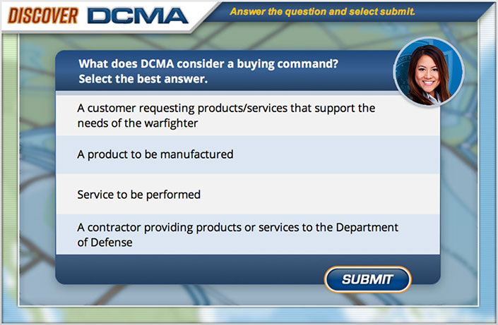
U.S. DEFENSE CONTRACT MANAGEMENT AGENCY: DISCOVER DCMA
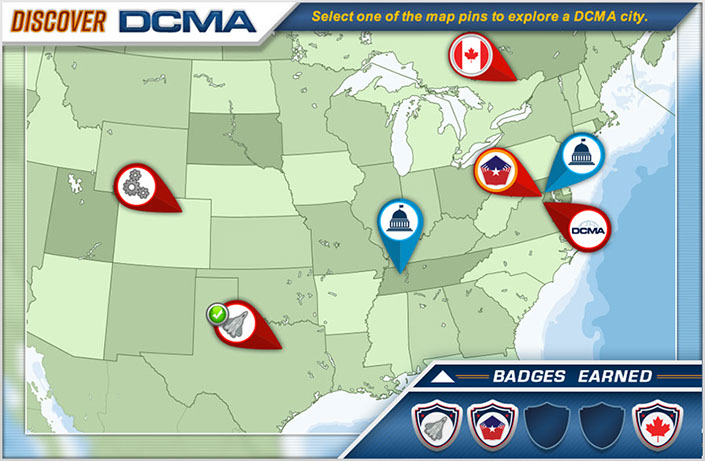
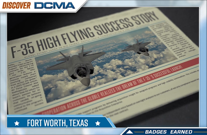
DISCOVER DCMA : THE GAME
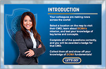
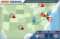
DCMA as part of a course that is being created to introduce new employees to the array of services and capabilities the DCMA offers the federal government. They wanted a game created that taught key terms regularly used in the field. It was decided that the content needed to be introduced in an engaging and entertaining way for maximum retention. "Gamification" always provides a great opportunity to break of the monotony of general of standard e-Learning.
Come travel around the world and even into space with DCMA! To to the Game NOW!
GENZYME (a SANOFI COMPANY) - LEMTRADA
GENZYME - LEMTRADA
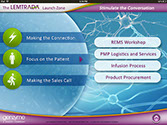
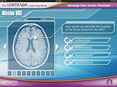
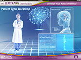
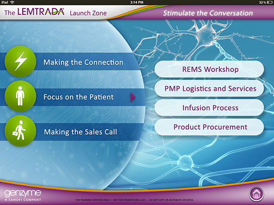
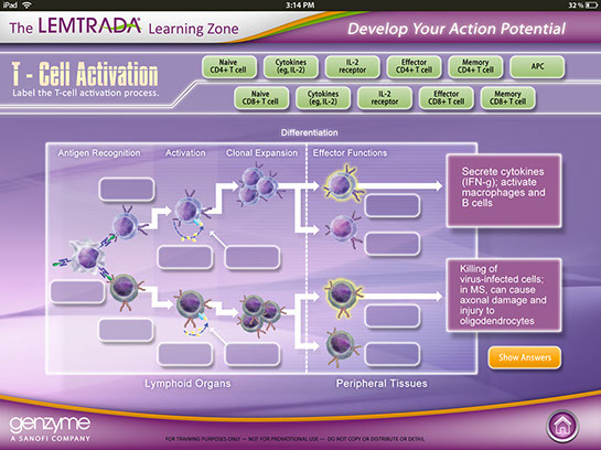
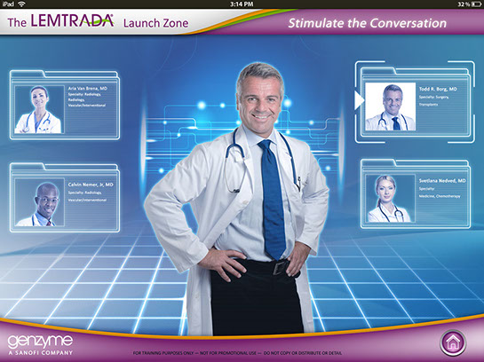
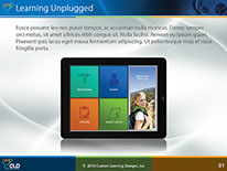
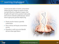
This was interactive multimedia tablet application to introduction sales reps for Sanofi Genzyme to educate them on the drug Lemtrada so that they could engage in meaningful conversations with Doctors and answer any questions they may have when considering prescribing Lemtrada to patients. I was brought on as a contractor by Custom Learning Designs (CLD) to great the look and feel and produce layouts for how the interactive elements would look, a long with how the green screen videos would look.
Examples below show standard screen types. (Menu Nav, Multiple Choice, Drag & Drop, Interactive Video)
CUSTOM LEARNING DESIGNS
CUSTOM LEARNING DESIGNS, INC. - CORPORATE MATERIALS
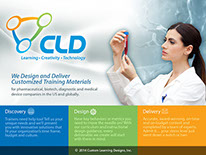
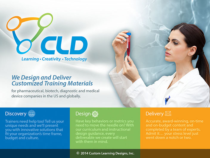
Contracted to do a redesign/update of Custom Learning Designs corporate materials. These materials were used for marketing presentations regularly put in front of pharmaceutical industry giants by the CLD sales and marketing team. Working with CLD's creative director I was able to meet there goals of creating a fresh new style, while keeping intact the CLD identity.
FEDERAL CONSULTANT GROUP
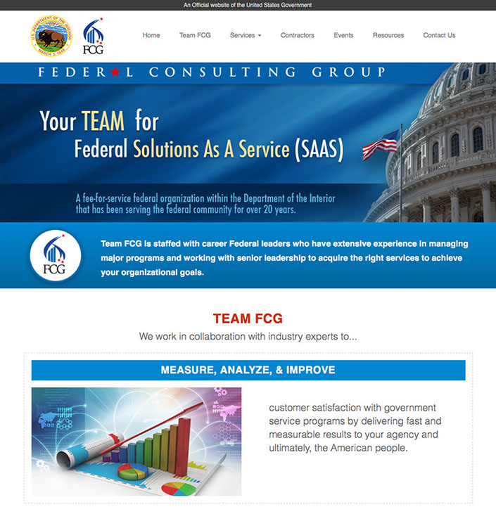
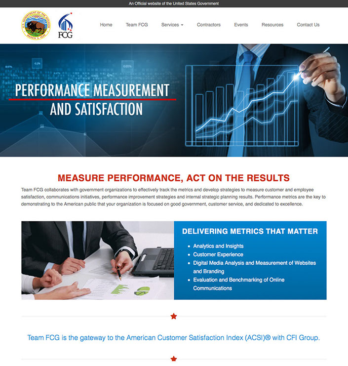
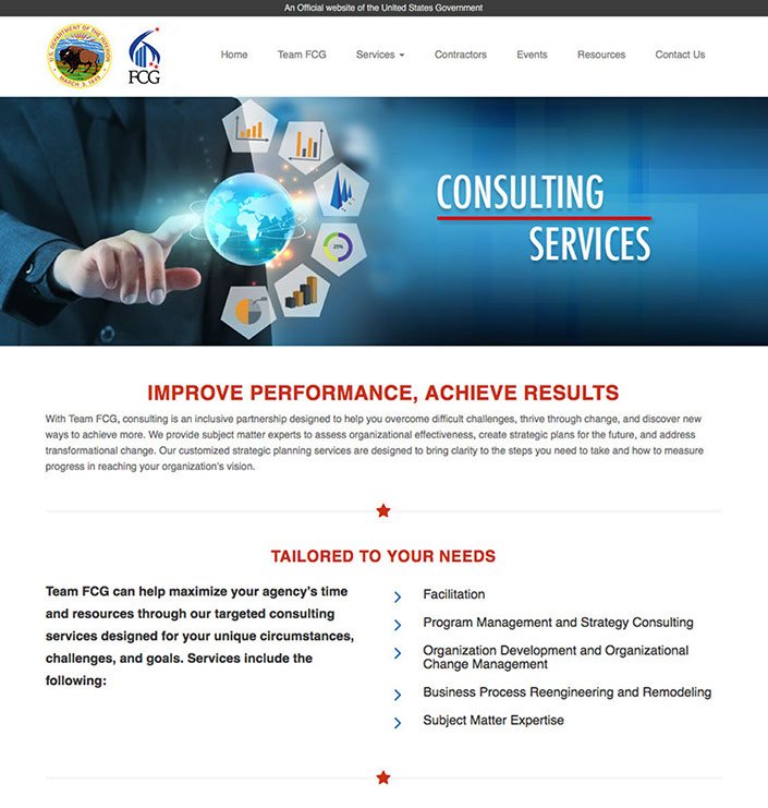
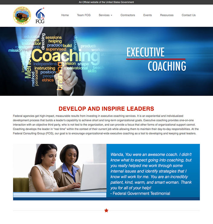
FEDERAL CONSULTING GROUP (FCG) part of (DOI)
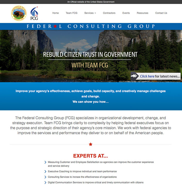
As the Creative Director for Cybermedia Technologies I was part of the team that went out captured this contract for a website redesign, along with behind the scenes Salesforce integration. FCG is essential a consulting agency in the U.S. government within the Department of Interior. The outwards facing portion of the contract was to create a more sophisticated professional look and feel for FCG, similar to private consulting firms. I created the new professional looking website in Drupal (DOI's CMS of choice). FCG wanted something created in an LMS to allow them to facilitate their own updates and maintenance once the website was handed off.
For a closer look go to www.FCG.gov now.
.
YOUTH CIVIL RIGHTS ACADEMY
YOUTH CIVIL RIGHTS ACADEMY
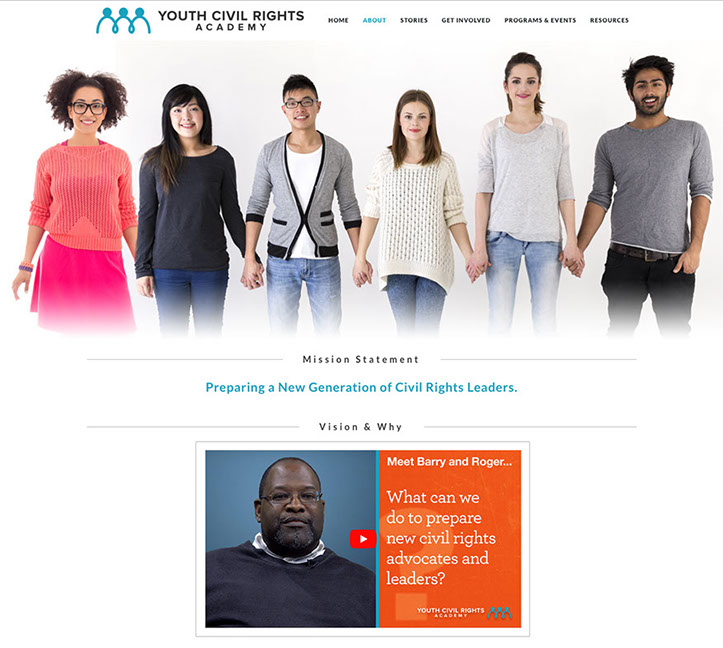
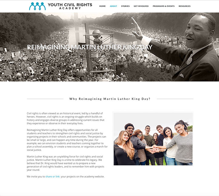
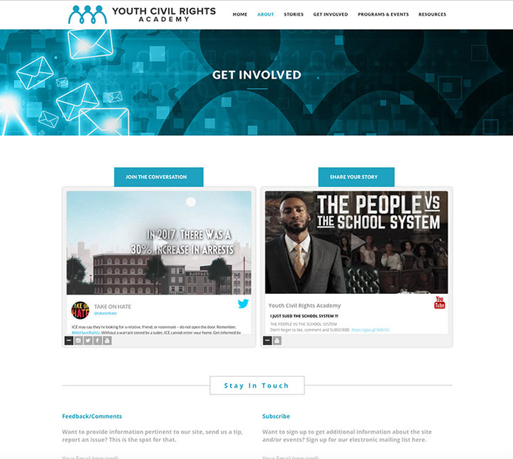
Youth Civil Rights Academy is an organization that was created in partnership with the University of Michigan's School of Sociology and The University of Michigan Academic Innovations Department. Contracted by UM-IA was brought in to work with the subject matter expert for YCR to create a website built in a maintainable,by the client, CMS (Wordpress). I was responsible for creating all the graphics, laying out the website and formatting the content, working in conjunction with the UM-IA dept. in keeping the look and feel they were establishing for the video content.
Visit Youth Civil Rights Academy for a closer look.
U.S. CUSTOMS AND BORDER PROTECTION - LA CHAMBA
CBP - LA CHAMBA (The Job)
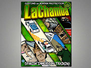
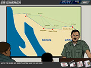
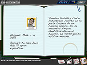
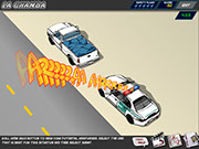
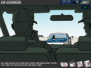
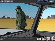
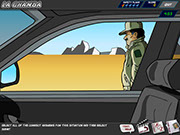
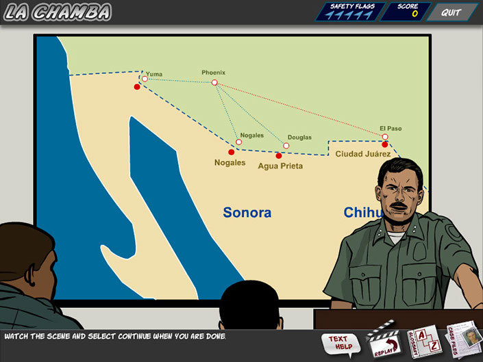
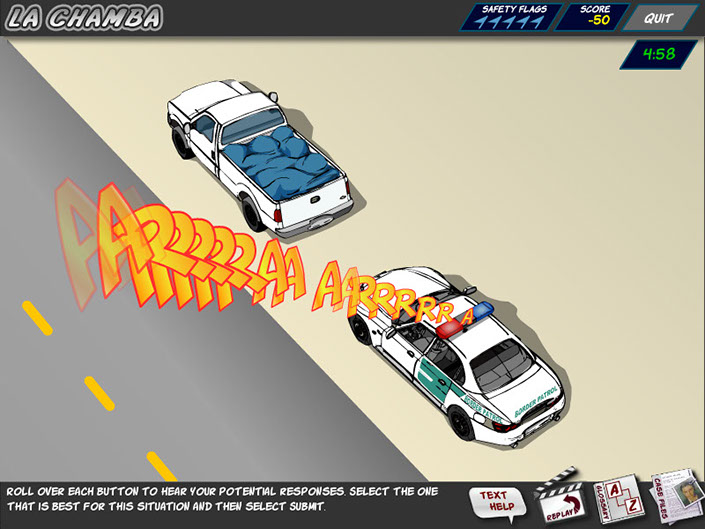
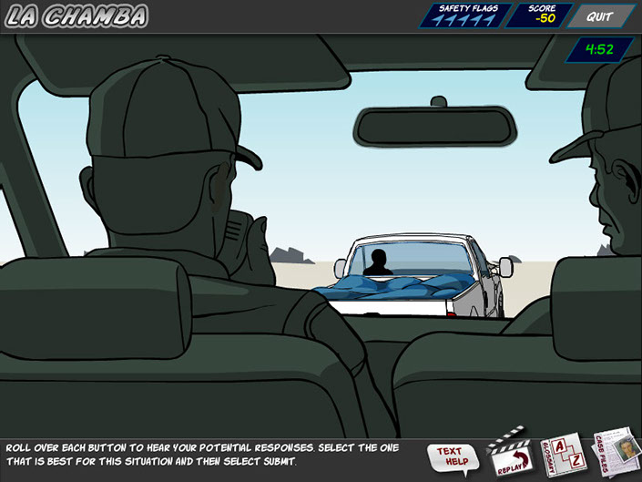
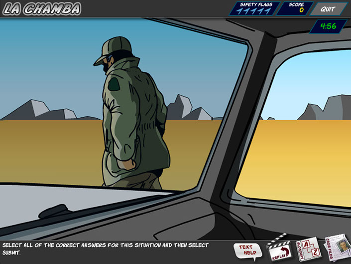
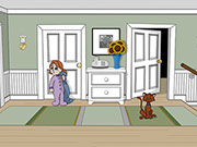
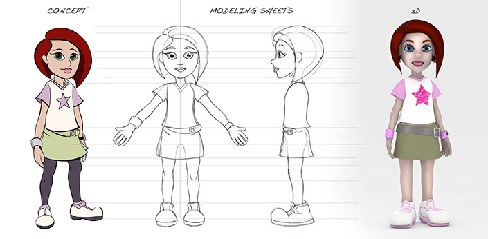
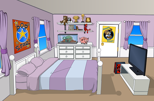
U.S. Customs and Border Protection needed an better way to teach Spanish immersion for the CBP agents that protect our southern borders. Traditional methods of classes and testing had a pass rate of 32%. With this interactive crime solving game the rate went up to 84% . Responsible for creating the comic book style for this course, I created many illustrations and animations that included lip syncing characters.
Clues through out the game allowed the agents to figure out who the head of a crime syndicate was... what fun!
DEPARTMENT OF HOMELAND SECURITY
DHS - BUYS
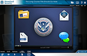
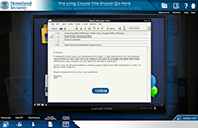
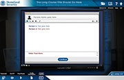
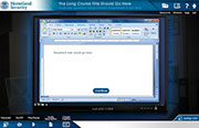
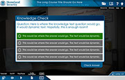
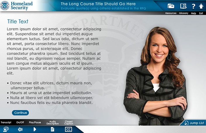
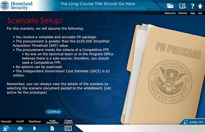
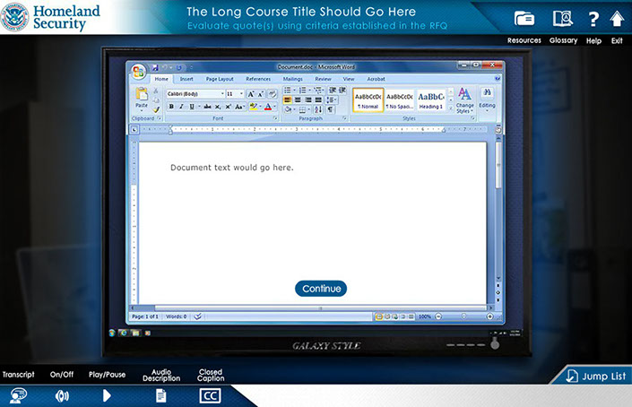
responsible for the creation of the look, feel and execution of DHS Buys, I created a design that utilized multiple interactive elements with integrated seamless green screen video characters. the user was presented with an office scenario where they had to interact with multiple office personnel to get direction to understand their given task and complete it. Intermittent reminders and helpful information would occur as the user progressed via a simulated "chat" conversation, e-mail, and accessing MS Word docs. Knowledge checks were utilized through out the course to test the users understanding of the material they were presented.
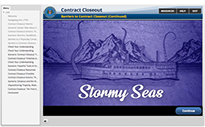
U.S. DEFENSE ACQUISITION UNIVERSITY - CORPORATE LADDERS GAME
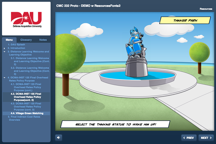
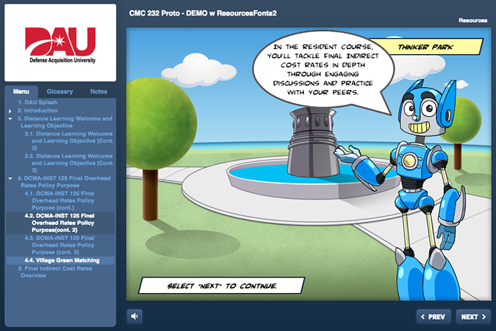
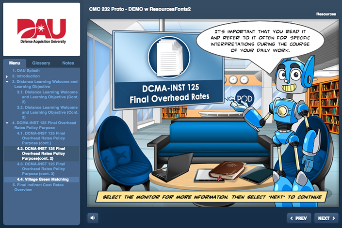
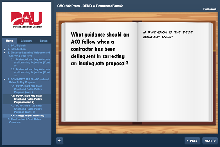
DAU - CMI 101 COURSE: CORPORATE LADDERS GAME
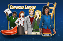
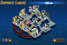
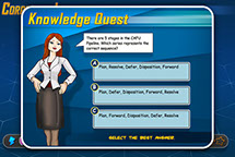
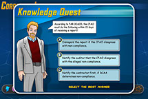
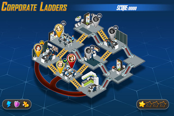
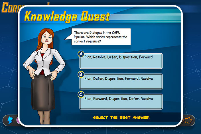
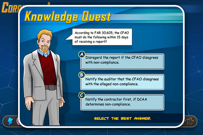
The Corporate ladders game was build to test the DCMA acquisition and logistics specialist about the use of nonconforming materials and the challenges they provide. Responsible for game design and artwork this project is another example of the popular method of "gamification" to teach and engage the user on what is sometimes quite honestly, very dry material.
Should you take the longer easier path or the shorter harder path? Be careful or you will find your self sliding back to the beginning!
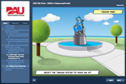
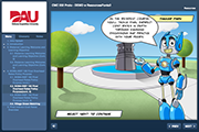
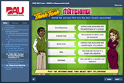
U.S. DEFENSE ACQUISITION UNIVERSITY - THINKATOPIA GAME
DAU - CMQ 242 COURSE: THINKATOPIA GAME
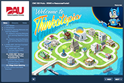
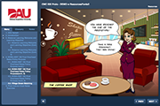
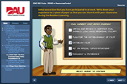
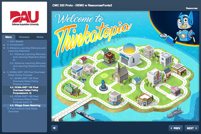
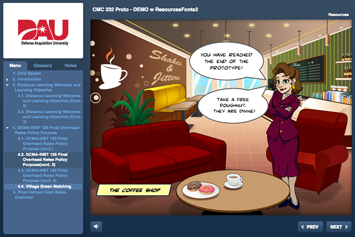
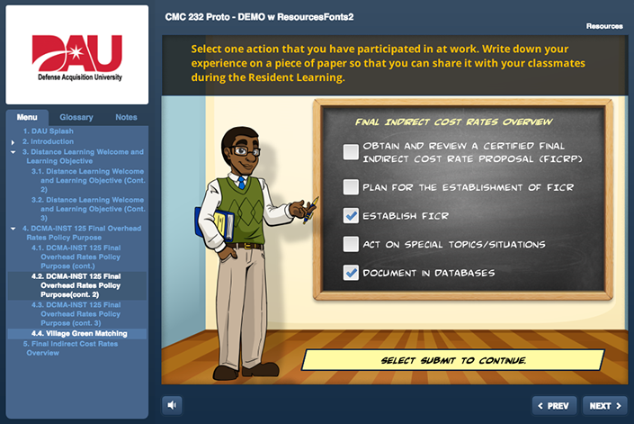
This sweet little scenario based adventure takes the user around the mythical town of Thinkatopia. The user is guide by their trustee companion the robot Think-R2000... or Think-R for short. Visiting various places in the town the user interacts with important characters that direct the user in the best practices to do their job.
Stop in at Shakes and Jitters to grab a pastry some java and your everyday caffeine pick-me-up!
AVHAP - OWNES & MINOR UNIVERSITY
AVHAP - OWNES & MINOR UNIVERSITY
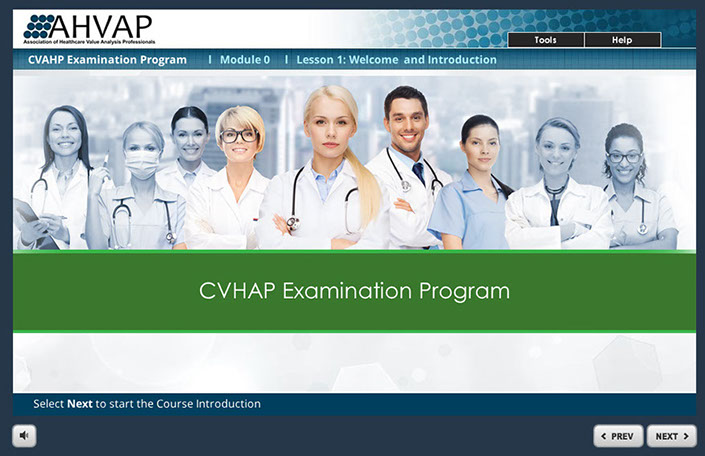
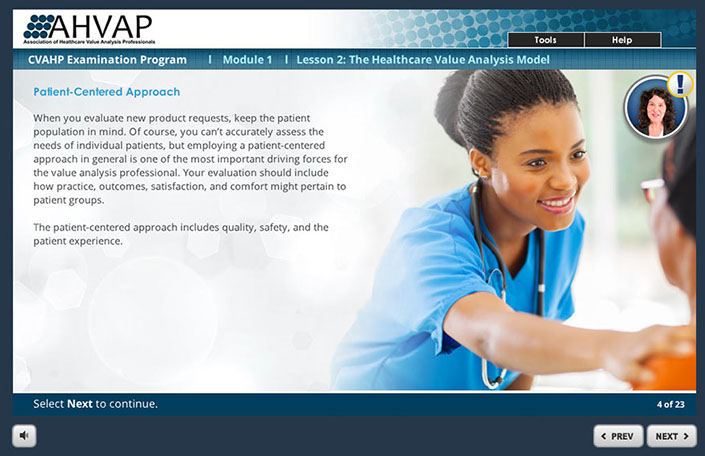
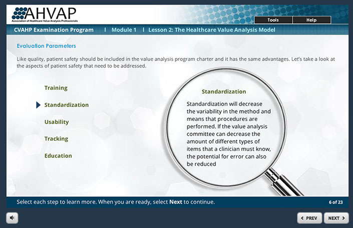
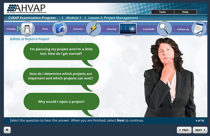
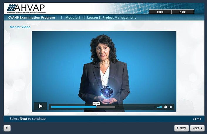
This course was designed to help Healthcare administrators learn to take a Patient-Centered approach to the intricate value analysis process. Helping users to learn important key factors to use to help determine the best outcome for new product request purchases. Responsible for the look and feel of the course and also programming the course in Articulate Storyline.
OFFICE OF PERSONAL MANAGEMENT - FEDERAL EMPLOYMENT OPPORTUNITIES
OPM - FEDERAL EMPLOYMENT OPPORTUNITIES
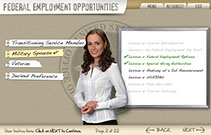
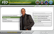
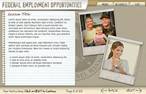
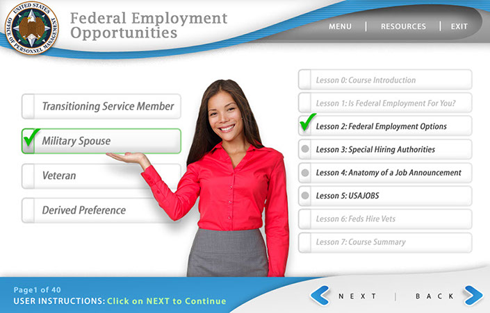
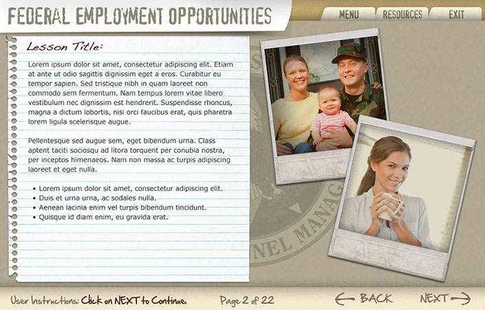
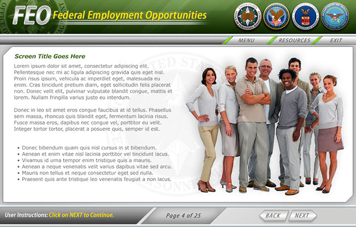
Three example interfaces created for the client to choose from for OPM's Federal Employment Opportunities. This course was to help train FEO employees how to help former military and military spouses employment opportunities within the Federal Government. Ultimately the first interface was used because of it's low-key everyday approach.
TURUMO BCT
TURUMO BCT
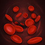
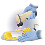
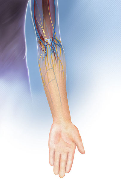
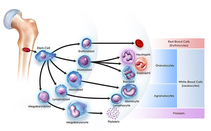
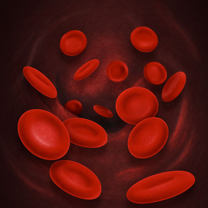
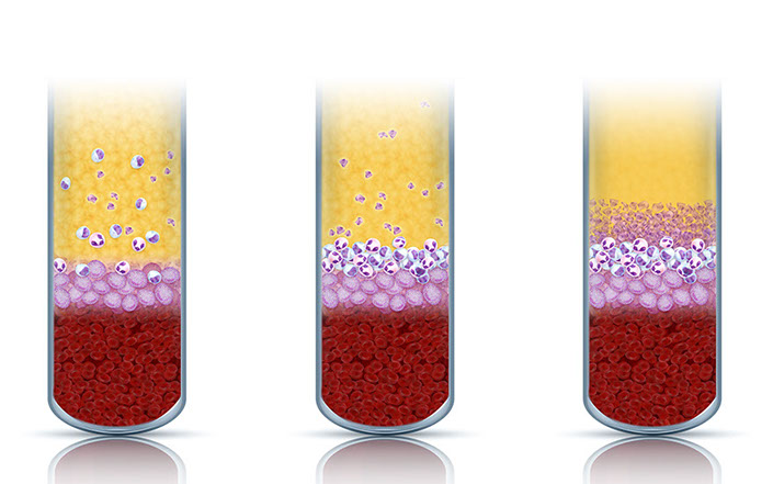
TERUMO BCT is a medical supply company that mostly deals with blood storing technology. They needed a quick turn around for several Medical Illustrations for a course they were developing. Leveraging my background and master's degree in Biological and Medical Illustrations I was able to meet their needs in a timely manner. Here are a few standalone samples.
UNIVERSITY OF MICHIGAN - ACADEMIC INNOVATIONS (formerly Digital Education and Innovation)
U of M - ACADEMIC INNOVATIONS
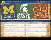
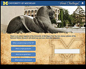
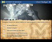
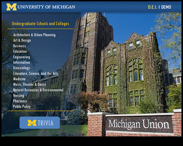
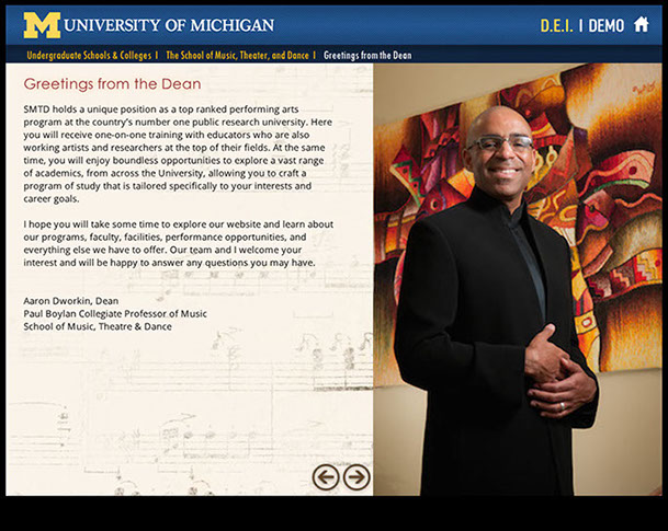
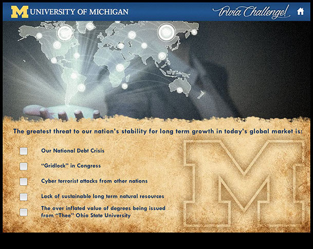
A demo for the University of Michigan's Academic Innovations dept. so demonstrate design capabilities and knowledge of Articulate Storyline programming skills. While it is a relatively short walk through, as a U of M alumni, it was a lot of fun to create.
Hail to the Victors Valiant, Hail to the Conquering Heroes! Hail! Hail! To Michigan the Leaders and Best!
FUN STUFF! (Illustrations and Other Odds and Ends)
Fun Stuff! (Illustrations and Other Odds and Ends)
responsible for the creation of the look, feel and execution of DHS Buys, I created a design that utilized multiple interactive elements with integrated seamless green screen video characters. the user was presented with an office scenario where they had to interact with multiple office personnel to get direction to understand their given task and complete it. Intermittent reminders and helpful information would occur as the user progressed via a simulated "chat" conversation, e-mail, and accessing MS Word docs. Knowledge checks were utilized through out the course to test the users understanding of the material they were presented.
An Animated Holiday Card utilizing Adobe After Effects created for Cybermedia Technologies Inc.
GO NOW >
A splash animation used to make sales and marketing people at Genzyme Pharma aware of their new drug Lemtrada. Created with 3DS Max and Adobe After Effects.
GO NOW >
A splash animation to make Janssen Pharmaceutical Coaches aware of the FLAG APP. An on-boarding and coaching too. Created using 3DS Max and Adobe After Effects.
GO NOW >
A splash animation used to make sales and marketing people at Alcon used for their EnVision sales and marketing pitches. Created with Adobe After Effects.
GO NOW >
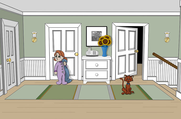
A hand drawn Holiday Card created for PerformTech Inc. with over 3000+ individual drawings.
Created with ToonBoom's Animate Pro and Adobe After Effects.
GO NOW >
An intro animation created for the Defense Acquisition University's CMC 101 on-line course. This animation was created with Adobe After Effects. Voice over by yours truly!
GO NOW >
A splash animation used for sales and marketing people at Sanofi to be aware of a new learning and training module on the way to help them in the field. Created with Adobe After Effects.
GO NOW >
A quick and dirty animation to give the client at Help.CBP.gov an idea of what was possible to put in their new website. The client the mock up so much they decided to use it.
Created with Adobe After Effects.
GO NOW >
